
JPMorgan Chase, ESG Dashboard
Project Overview
At JPMorgan Asset Management, sustainability analysis was fragmented and conducted using 7 different legacy tools. As a result, portfolio managers found it challenging to make ESG-driven investment decisions both efficiently and with a high degree of confidence.
Timeline: 7 weeks (Research → Design → Validation)
Team: 2 PMs, 1 Data Scientist, 1 Finance SME, 4 Engineers, and me as the sole interaction designer
My Role: Led discovery, remote workshops, system mapping, and end-to-end product design.
“Is the company sustainable for a long term investment?”
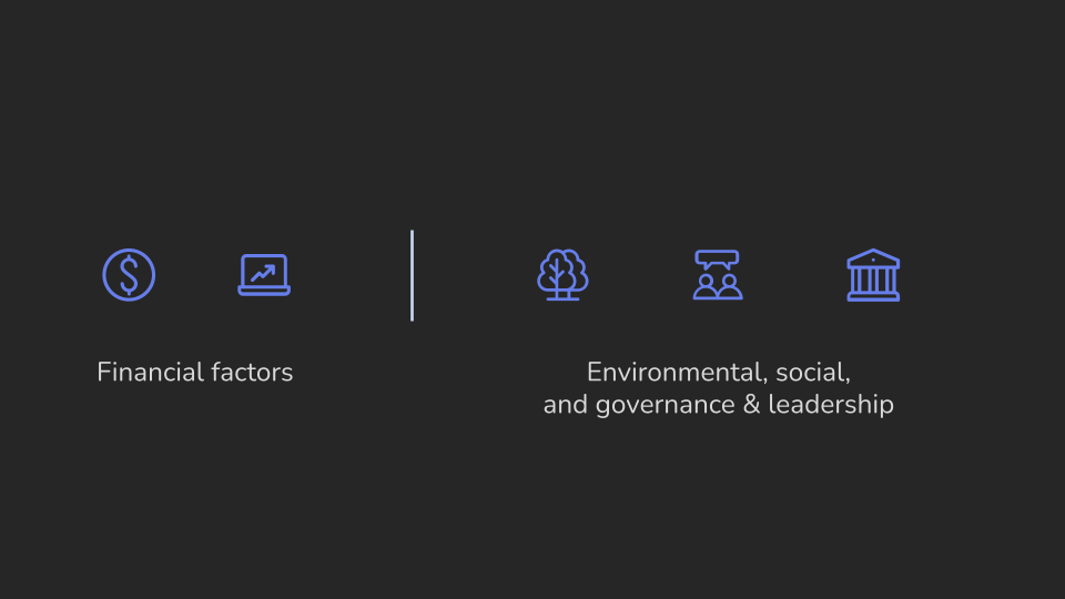
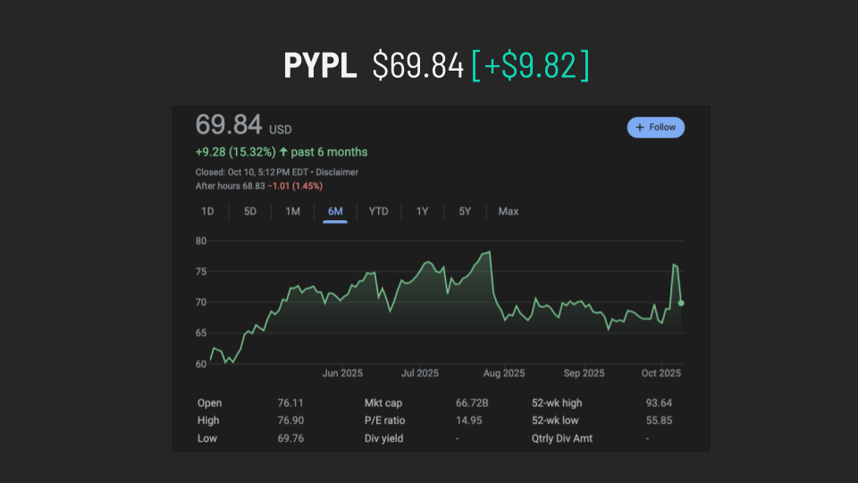
What ESG? ESG (Environmental, Social, Governance) factors help investors evaluate companies beyond just financial performance. When assessing PayPal, for example, portfolio managers analyze both traditional metrics and ESG criteria to make informed, sustainable investment decisions.
The challenge
How can we help portfolio managers make confident, sustainability-based investment decisions on their own, without needing analysts to explain complex ESG data? Typically, decisions take two weeks to a month, but with careful planning and efficient work, this can be faster. Focus on prioritizing tasks, clear communication, removing delays, and using technology. Assign clear roles and use project management tools to track progress in real time. These steps can speed up decisions while maintaining quality.
Pain Points in ESG Data Management and Decision-Making
Fragmented Data Ecosystem
ESG data scattered across seven applications makes consolidation and analysis difficult, limiting visibility and consistency.No Benchmarking or Comparison
Lack of benchmarking tools prevents companies from contextualizing performance or identifying improvement areas.Analyst Dependence
Manual data interpretation slows decisions, increases bias, and adds workload pressure.Prolonged Decision Cycles
Decisions that should take minutes often take days or weeks, reducing agility and responsiveness.High Cost & Human Error
Manual handling drives up costs and error rates, compromising data accuracy, trust, and business resilience.
“I have to open seven tabs and two spreadsheets just to know if this company is ESG-compliant.”
Examples of the multiple screens on 2-4 monitors.
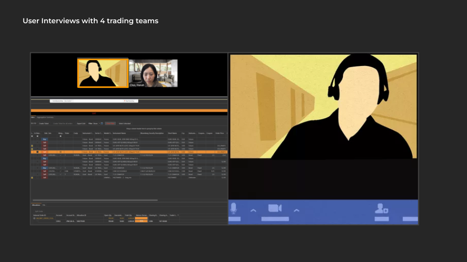
Research Insights
4 different trading teams in different region
65% of queries to the analyst portal were ESG-related.
Average time to get clarity: 1–2 weeks.
Remote, real-time walkthroughs revealed inconsistent ESG data definitions.
Users wanted comparative, sector-level context—"I need to know if PayPal's governance drop is normal or alarming."
Design vision
To build an intuitive ESG Dashboard that aggregates, compares, and visualizes sustainability data—empowering faster, more confident decisions.
Key Design Goals
Aggregate ESG + financial data in one place
Compare companies by sector and benchmark
Personalize by user entitlement
Visualize score trends over time
Reduce dependency on analyst interpretation
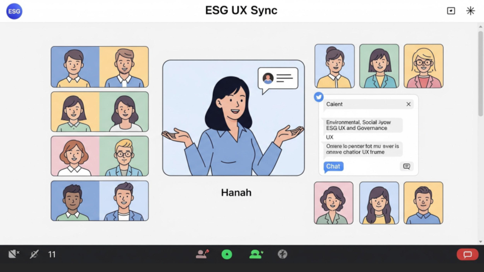
Co-design and iteration
I ran virtual sketch sessions with product and finance teams.
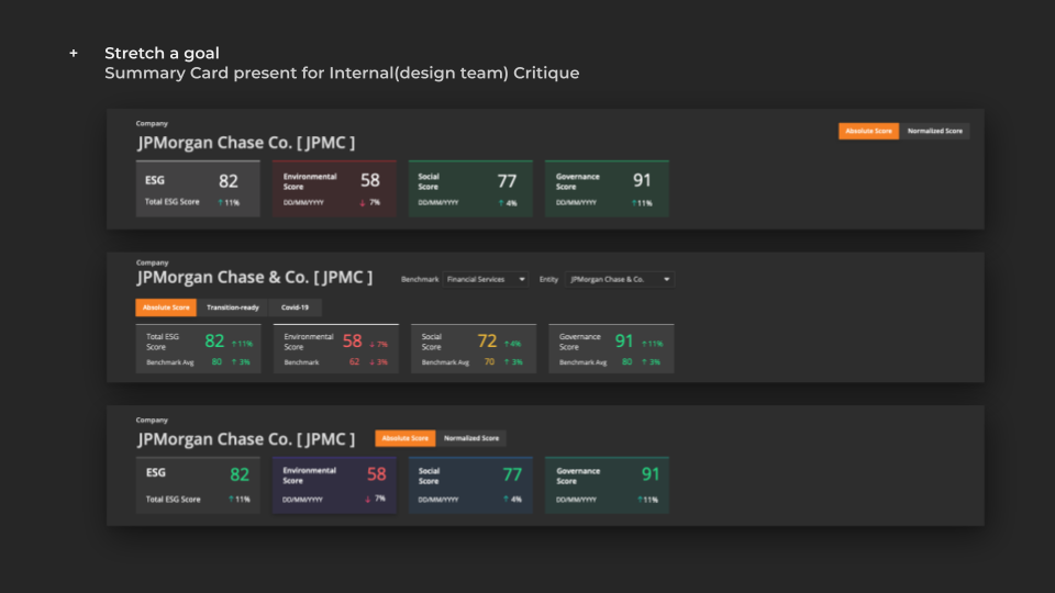
Aha moment: When a trader drew a simple "score card" comparing PayPal vs Square, the team instantly saw the value of cross-company visualization — this idea became the foundation for the "Summary Card.".
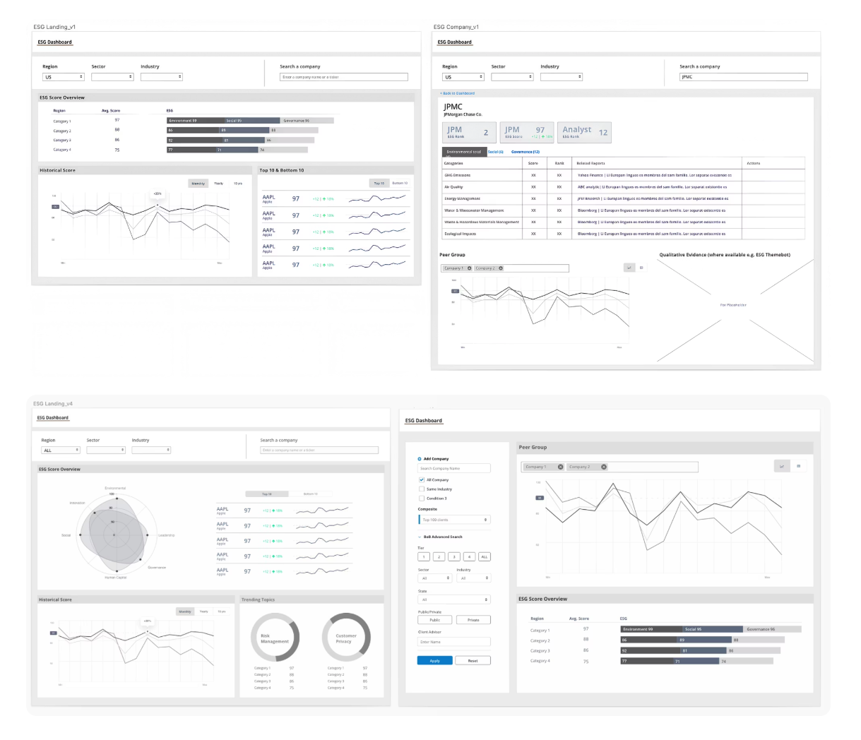
Key features defined with low-fidelity designs
Critical User Feedback
Need comparison data across peer companies
Require broader company context beyond ESG metrics
Must show benchmark/sector performance comparisons
Early stakeholder involvement essential for buy-in
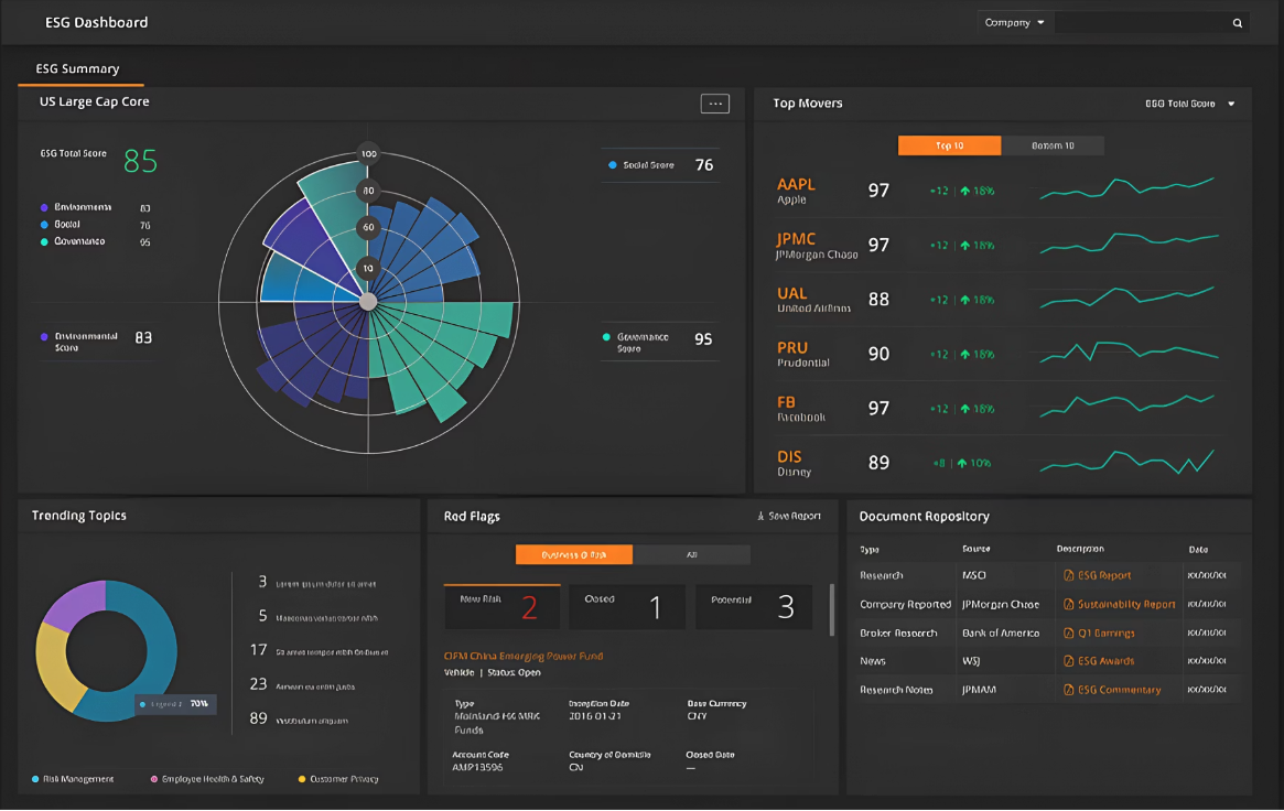
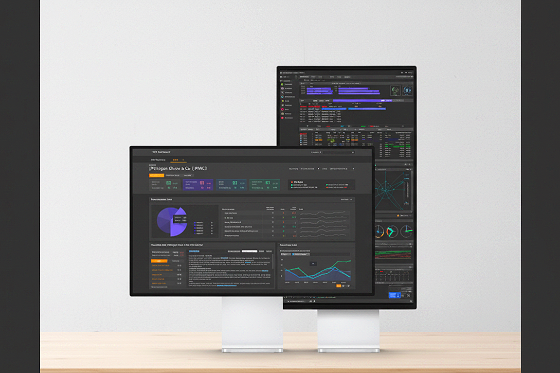
Design: Dashboard
Top movers: Portfolio trends highlighting ESG shifts
Summary view: One-glance sustainability snapshot
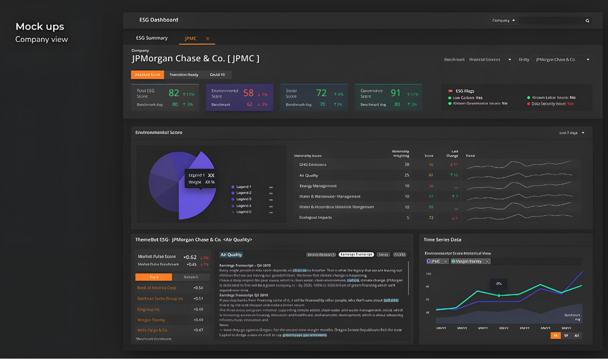
Company View
Company comparison: Cross-sector benchmarking
Company detail: Median and metric-specific breakdowns
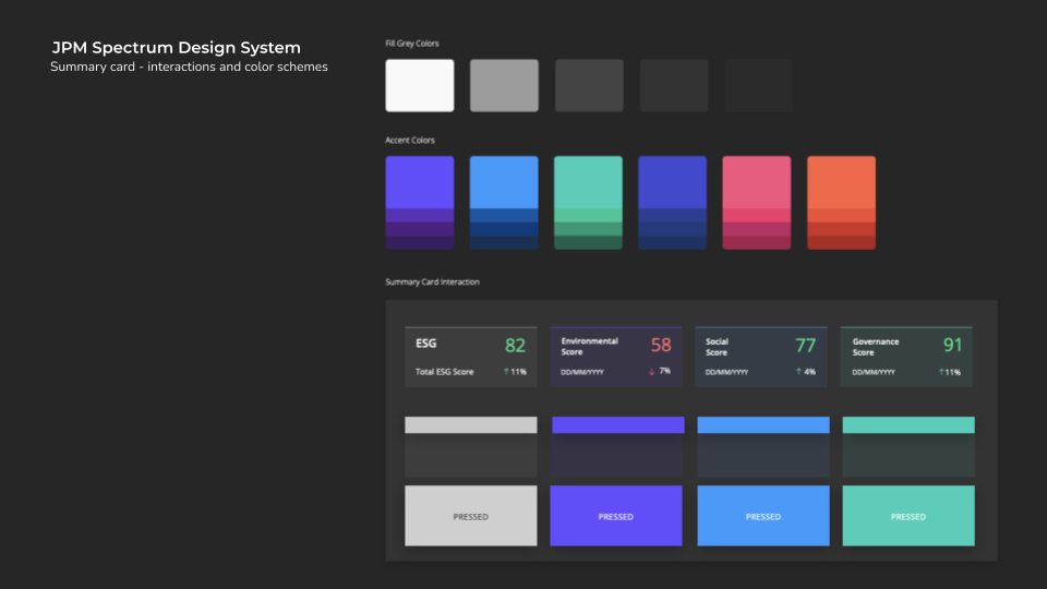
Core Design Component Contribution
Final Validation and product ship
I facilitated an MVP feature walkthrough using a fictional prototype to align stakeholders and users, validate the experience, and ensure feasibility with engineering partners.
“Wait — I can see ESG and risk data side-by-side? This would save my entire Monday report run.”
“Is the company sustainable for a long-term investment?”
How quickly can we really answer this question?
In the past, answering a question like this meant days or even weeks of deep analytic dives — gathering data from multiple sources, aligning reports, and reconciling human interpretations before reaching an answer.
Now, with the new ESG Dashboard experience, the answer is instantaneous and data-driven.
The system analyzes sustainability performance, benchmarks competitors, and visualizes governance and risk data in seconds — transforming what once took weeks into minutes.
Outcomes & Impact
“Better than any dashboard we’ve ever had.”
78-90% Faster Decision Cycle
Decision-making time was reduced from 1–2 weeks to minutes through streamlined data aggregation and an intuitive interface design.9.8% Reduction in Investment Risk
Enhanced business analytics enabled significant risk mitigation, saving millions of dollars monthly by supporting better-informed ESG decisions.Q4 2020 US Launch & Optimization
Initiated with US-focused user groups, employing sprint-based evaluation cycles to continuously improve data performance and user experience.Cross-Team Design System Adoption
The summary card component was integrated into JPMorgan's internal Design System, with its data-visualization library reused across three enterprise products, extending the design impact beyond the original ESG Dashboard.Key Takeaway: Good enterprise UX isn't just about clarity; it's about empowering people to act responsibly with confidence and speed.